Logo
Logos are built on a shared system that standardizes structure, spacing, and typography across brands, while allowing each to maintain a distinct identity. This ensures consistency at scale and enables logos to work seamlessly across product, marketing, and partnerships.


Primary
The primary logo combines symbol and wordmark into a unified lockup, with defined color variations for different backgrounds and contexts. It should be used as the default expression of the brand across most surfaces, ensuring clarity, recognition, and consistency.
Download all

Symbol
The symbol logo isolates the core mark for use in compact or repeatable contexts, such as app icons, favicons, and small-scale placements. It maintains the same color system as the primary logo and should only be used where the full lockup is not viable.
Download all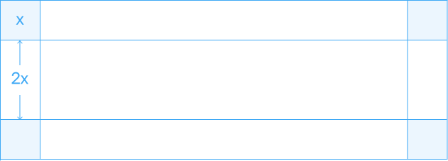
Clearspace
Clearspace defines the minimum space around the logo to maintain legibility and visual impact. This space should always remain free of other elements, ensuring the logo is clearly distinguishable and consistently presented across all applications.
Do not outline.
Do not use the wordmark by itself.
Do not apply effects.
Do not rotate.
Do not create sub-brands or lockups.
Incorrect usage
Do not alter the logo. Avoid the following treatments.